- Forum
- categories
- Announcements and miscellaneous
- General announcements
- Announcements and discussions regarding SuSanA
- We are upgrading this Discussion Forum! (April 2017)
We are upgrading this Discussion Forum! (April 2017)
71.1k views
- lizkora
-
Less
- Posts: 8
- Likes received: 3
- Elisabeth
-
Topic Author
- User is blocked
- Freelance consultant since 2012
Less- Posts: 3372
- Karma: 54
- Likes received: 932
Re: Forum upgrade successful!! What do you think?
- We have changed the font.
- We have removed the quick reply button and replaced it with "reply".
Further explanations (both issues were brought up earlier in this thready, scrol up to Page 1 and 2):
E.g. Chris Canaday who had pointed out that:
Also the font here in the window for writing posts should be bigger and clearer. For example, it is hard to distinguish commas and periods.
So we have changed the font to Montserrat Regular. This is easier to read, we think. Also it distinguishes better between comma and fullstops. The other special characters are slightly bigger, too. The old font was called Raleway. The new SuSanA website (to be re-launched around 20 August) will use the same new font - Montserrat Regular.
Another thing that Chris and others had remarked on was the confusion surrounding the Quick Reply button:
Another is that emoticons are not there to choose from, in the Quick Reply. (What is the point of Quick Reply? And why is Reply only visible if you open the Action Menu?)
We have now changed it so that there is a big black "Reply" button below each post. If someone still wants to access the so-called "quick reply" button (perhaps it's faster for lower internet speeds), then you find it under "Action" now.
Any feedback? I hope you like the new font?
Regards,
Elisabeth
Freelance consultant on environmental and climate projects
Please Log in to join the conversation.
You need to login to reply- Elisabeth
-
Topic Author
- User is blocked
- Freelance consultant since 2012
Less- Posts: 3372
- Karma: 54
- Likes received: 932
Re: Forum upgrade successful!! What do you think?
Mobile version: For people who have uploaded a profile photo, we are now showing these profile photos as small pictures inside of the threads (similar to the desktop version).
Desktop version: We have limited the size of portrait-style photos, as some of them had been too large (after the change-over to the new Kunena version) and thus dominated the page too much. If you already uploaded your profile photo please double check how it looks now, particularly if it was a portrait photo. If the format didn't work out right you might need to upload a different one now.
Perhaps this is an incenctive to upload your profile photo if you haven't done so yet? Just click at the top on "My profile", then "edit profile", then "Avatar Image" when you're logged in. Or check here in the help section: forum.susana.org/134-user-profile
And you don't need to upload a close-up photo of yourself if you'd rather not. Some people have added a photo of themselves at work, or of the scenery they work in, or even just a team photo or a logo of the organization if they write in their capacity of working for that organization. There are many options for you to decide what works best for you.
Regards,
Elisabeth
P.S. Don't hesitate to put here into this thread any further improvements you'd like to see, particularly with the mobile version. We're always grateful for your feedback!
Freelance consultant on environmental and climate projects
Please Log in to join the conversation.
You need to login to reply- Elisabeth
-
Topic Author
- User is blocked
- Freelance consultant since 2012
Less- Posts: 3372
- Karma: 54
- Likes received: 932
Re: Forum upgrade successful!! What do you think?
About the issue with the forum's e-mail notifications of new replies in a thread that you have subscribed to:
Steffen (our IT person) would like to know which e-mail client you are using?
He wrote to me: "this is not a browser problem it depends on the email client, from google mail within the browser it works anywhere. I don't know which email client/provider she is using?"
We already found out from Esther that it doesn't work if your e-mail client is IBM Notes.
Regards,
Elisabeth
Freelance consultant on environmental and climate projects
Please Log in to join the conversation.
You need to login to reply- Elisabeth
-
Topic Author
- User is blocked
- Freelance consultant since 2012
Less- Posts: 3372
- Karma: 54
- Likes received: 932
Re: Forum upgrade successful!! What do you think?
Thanks for your words of praise!
I also love the new mobile version and use my smartphone a lot to read forum posts. Today I noticed that the mobile version does not yet have the Google Translate ("Select Language") button at the top and have asked Steffen, our IT guy, if that can still be added. I would also like to see the profile photos of the other users more easily on the mobile version but I don't know if space on the "recent topics page" will permit this.
To all: if you notice anything not ideal with the mobile version (i.e. using the Forum with your phone or tablet), please post it here in this thread.
Dear Carol,
Yes, when we did the large formalised user experience study we defined 6 tasks (called scenarios) for the Forum and 6 tasks for the mother website. These tasks are described in the moderator's guide which I had posted here: forum.susana.org/10-announcements-regard...ble-for-your-comment
I summarise the tasks (called scenarios) which our panel of 12 users had to do on the Forum here:
- Scenario 1B. Forum discussion
a. Navigate to forum from outside
b. Find Thematic category > subcategory > particular thread
c. Find first post
d. Respond to last post
- Scenario 2B. Forum - home (this one was relating to the so-called front door page, which we have since changed to being much shorter and called "guide for newcomers")
- Scenario 3B Find recent post overview
- Scenario 4B Find posts by profile name
- Scenario 5B
a Update profile
b Use help
- Scenario 6B. Relationship with mother site (very important one!)
Each of these scenarios is explained in more detail in the moderator's guide:
Please log in or register to see it.
If anyone has time for testing, or is curious about the user experience (UX) methodology, do take a look at the attached file and go through the scenarios and tell us what you think, please.
(just keep in mind that we use an existing software, called Kunena, and there are certain things, like the main setup how the forum works, which we cannot change)
Carol: thanks for pointing out which browsers work for the "read online" button in e-mail notifications from the forum and which don't. I fear that this is probably something that Steffen cannot influence which is a pity. But perhaps Kunena will fix that in the future so that it works equally well for all main browsers.
Regards,
Elisabeth
Freelance consultant on environmental and climate projects
This message has an attachment file.
Please log in or register to see it.
Please Log in to join the conversation.
You need to login to replyWhat I love about the Forum is getting a good answer to my question that is automatically shared with everyone!
It's good to know, Elisabeth, the the SuSanA site AND Forum will get some user testing in coming months. I chatted with Claudia (CWendland) about this and she asked me this: "Do you have a set of questions or tasks which the testers should find out in the forum?"
What a good idea to think about specific questions and tasks for Forum user experience testing - both our informal testing now and to be shared with the Forum project team for later, more systematic testing.
As for clicking on the blue button in emails when trying to get to post mentioned in the email. Yes! It works in Chrome. No, it does NOT work in Firefox or Safari. In Firefox and Safari the best thing to do is to click on "Start" in the grey box toward top right to land on the most recent posts.
(By the way, I use Firefox because it is a nonprofit organization which offers security and privacy and is fighting for "Net Neutrality." Among the many problems facing us here in the US is the potential takeover of an open and neutral Internet by big corporations. Mozilla, which managed Firefox, is standing up for us.)
Carol
Public Hygiene Lets Us Stay Human (PHLUSH)
1240 W. Sims Way #59, Port Townsend, Washington 98368 USA
Toilet availability is a human right and well-designed sanitation systems restore health to our cities, our waters and our soils.
Please Log in to join the conversation.
You need to login to reply- lizkora
-
Less
- Posts: 8
- Likes received: 3
Re: Forum will be offline for maintenance and upgrading this Thursday 27 May for 24 hours!
I use forum on my phone and it worked so well.
Your team has done a marvellous job. Navigating has become more friendly. Bravo!
Please Log in to join the conversation.
You need to login to reply- Elisabeth
-
Topic Author
- User is blocked
- Freelance consultant since 2012
Less- Posts: 3372
- Karma: 54
- Likes received: 932
Re: Forum upgrade successful!! What do you think?
I've repeated Carol's questions in italics below:
Testing? Will there be a follow up with more systematic testing?
We have no systematic testing planned for the near future but hope that with this kind of ad-hoc testing of our users, we will catch a lot of bugs or things that can be improved. So please everyone continue to provide your feedback here!
The more systematic testing that you described is planned for early 2018 for the entire SuSanA website and Forum, similar to what we did in the User Experience Study which was mentioned here: forum.susana.org/10-announcements-regard...ble-for-your-comment
That costs a few thousand Euros though, so is not something we can do all that often (same with surveys; they are fun but also take a fair bit of preparation and analysis work by someone).
Categories and sub-headings, pull-down menu of categories
Your suggestions for all capitals and colours in the pull-down menu of categories is not possible to implement in Kunena. However, you don't actually need to use that pull-down menu anymore. Simply navigate to the area where you want to make a forum post (starting with the big colourful buttons at the top). Once you are at the right place, just click on "post a new topic".
You can also access an overview of all sub-categories from the top menu bar under "Search & navigation", then "Categories". It takes you to here;
forum.susana.org/forum/categories
When I receive an email like today (Subject: [SuSanA Forum] Forum upgrade successful!! What do you think?) ... So I click the prominent blue button that says "read online". This is when I start wasting time. I would like to go immediately to the post mentioned, which is usually the last one. But still I have to look for it. (I'm attaching a screen shot of the inviting email with the blue "read online" button.)
This is strange as for me when I clik on the blue button which says "read online" in the e-mail, I get taken directly to the right place within the thread. Where does it take you? Does it take you to the start of the thread? I wonder if it depends on the type of e-mail browser that people use?
Have others experienced similar problems with the e-mail notifications from the forum? Is it working for you or not?
Regards,
Elisabeth
Freelance consultant on environmental and climate projects
Please Log in to join the conversation.
You need to login to reply- pave
-
Less
- Posts: 10
- Likes received: 5
- Elisabeth
-
Topic Author
- User is blocked
- Freelance consultant since 2012
Less- Posts: 3372
- Karma: 54
- Likes received: 932
Re: Forum upgrade successful!! What do you think?
(I'll answer your question first and then Carol's questions later, as yours is easier)
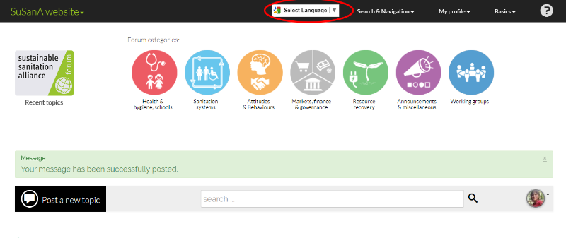
You asked about the translator button. We still have it but now I worry that it's a bit too hidden... If you go in the top menu bar you see a menu item called "Basics" (to the left of the question mark). Click there and then "activate translation". (edit on 2 June: we have changed it now so that the default is that the "select language" button is always visible in the top menu bar; if you want to hide it, go to Basics and click on "Deactivate translation").
Then you get an additional button in the top menu bar which doesn't look very pretty but it looks like this:
Using this button you can now translate the content of the forum into any language that Google Translate provides (which for me is still a little miracle!)
What's your feedback about this?
Apart from the translation button, I have no other immediate ideas how to include people who don't speak English well, other than direct e-mail contacts if you know anyhow, inviting them to join the forum.
But I fear that e.g. Spanish speaking or Portuguese speaking people probably have their own discussion fora for sanitation and might prefer to hang out there? Does anyone have further advice on this?
Regards,
Elisabeth
Freelance consultant on environmental and climate projects
Attachments:
-
 RecentTopi...rum2.png
(Filesize: 78KB)
Please Log in to join the conversation.
You need to login to replyRe: Forum will be offline for maintenance and upgrading this Thursday 27 May for 24 hours!
I want to ask about including other language options in the updated version. Have you thought about it and how to include interested people from other countries. I know this thread below from some time ago and wanted to ask if it was successful or not? The translate button was taken out again, maybe it did not work?
forum.susana.org/forum/categories/276-la...or-various-languages
Claudia
Water and Sanitation Specialist
HAMBURG WASSER
This email address is being protected from spambots. You need JavaScript enabled to view it.
www.hamburgwasser.de
Please Log in to join the conversation.
You need to login to replyI'm looking forward to my vacation. Why? So I can have fun playing around with the new Forum. RIght now I'm too busy! In fact, I think what we need now is a lot more people playing around with the Forum. Both content exchangers and current and new users who just want to try it out.
Testing? Will there be a follow up with more systematic testing? It needn't require a lot of people. Perhaps just 1) a small sampling of current users and first timers 2) who volunteer for a 30 minute online exercise in which 3) they are given four or five discreet tasks and then 4) take a simple online survey to report on their experience with each task.. This kind of simple user testing can bring a big return to investment.
Categories For new threads it's nice to have the categories available. But there are so many of them! Would this be off putting to first time users and those who don't know the Forum culture and how the categories have built up over time?
I don't know how much scope there is for using colors or embeddings in the pull down menu of categories. I see the top category headings are a grey color; perhaps also use ALL CAPITALS so they stand out?
As for the sub headings, I don't find the pseudo bullets with "-" and "—-" helpful. Wouldn't they stand out more if "___" and "________" were substituted? Of if colors were used? I understand that this categorization of categories cannot strictly obey logic. I just want to see my choices and how they fit together.
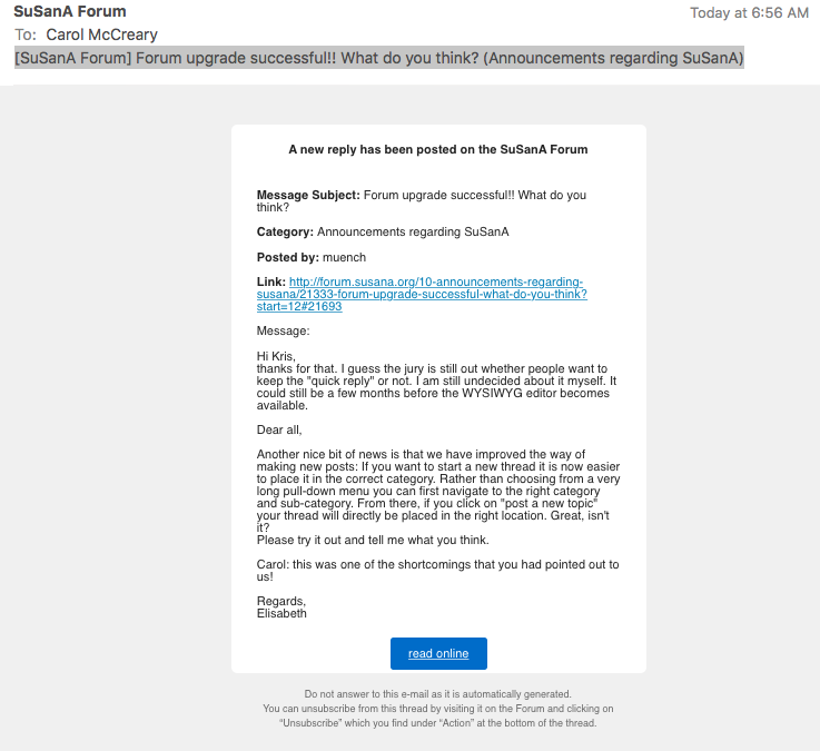
How to find a post in a thread Thank you for your reply on this Elisabeth. The reason why I find it a problem is that I'm really in a hurry these days. When I receive an email like today (Subject: [SuSanA Forum] Forum upgrade successful!! What do you think? (Announcements regarding SuSanA)] I want to not only read the post (which is there in front of me) but let others know that I am still following the thread.
So I click the prominent blue button that says "read online". This is when I start wasting time. I would like to go immediately to the post mentioned, which is usually the last one. But still I have to look for it. (I'm attaching a screen shot of the inviting email with the blue "read online" button.)
Thanks, everybody, for helping make the Forum better. And wish me luck getting ready for my (working) vacation.
Carol
Public Hygiene Lets Us Stay Human (PHLUSH)
1240 W. Sims Way #59, Port Townsend, Washington 98368 USA
Toilet availability is a human right and well-designed sanitation systems restore health to our cities, our waters and our soils.
Attachments:
-
 ScreenShot...5-31.png
(Filesize: 100KB)
Please Log in to join the conversation.
You need to login to reply- Forum
- categories
- Announcements and miscellaneous
- General announcements
- Announcements and discussions regarding SuSanA
- We are upgrading this Discussion Forum! (April 2017)

