- Forum
- categories
- Announcements and miscellaneous
- General announcements
- Announcements and discussions regarding SuSanA
- Our Forum got a new front door page (and new layout inside)!
Our Forum got a new front door page (and new layout inside)!
21.4k views
Re: Our Forum got a new front door page (and new layout inside)!
Hi,
Apparently I´m the opposite from Dorothee in some aspects. Before criticizing I should say that I am one of those who never likes changes… so keep that in mind. Therefore I thought of not answering right now, but as I don´t agree with Dorothee, I wanted to put my views.
Well for the green – I liked it, it was special/different, but I don´t have objections on that.
So – I will see how I feel in 3 weeks about it. I apologize for my critics, but as I said in the beginning- I don´t like changes - the new Skype I find horrible - the forum I would say for an expereinced user nothing better, but at least not much worse
  .
.
Cheers
Christoph
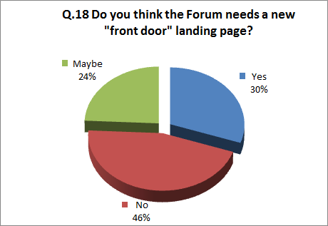
P.S. I think the user survey was not a justification to change the front page. 46% of the user saying no, only 30% saying yes – for me would indicate the opposite. You might decide anyhow that you want to change it – ok- but we should not justify with numbers which show the contrary.
Apparently I´m the opposite from Dorothee in some aspects. Before criticizing I should say that I am one of those who never likes changes… so keep that in mind. Therefore I thought of not answering right now, but as I don´t agree with Dorothee, I wanted to put my views.
- As somebody who uses the forum a bit it is annoying to have to click twice when you come from the daily digest. Why not go directly to the recent post page. Normally I open the mail, read through the topics, if there is something that interests me I click on the icon Susana. That should me link to the recent page – not to the entry page. As I have the digest I am not a newcomer.
- I don´t understand why to make the entry so large that it appears to cover the screen. Only by Dorothees post I understood that there is more than just the icon. I had a quick look on the first screen and did not notice that there is more to scroll down. Nowadays scroll down on an entry page .... (our web designer said when we restructured our page) that is a nogo!
- I think the icons are way too large. Opening the recent posts page, more than half of the page (13’ screen) is occupied by fix information I do not use as an experienced user. As well the blue bar with the moving yellow could be in the same line with post a new topic, therefore diminishing a lot the use of space.
Well for the green – I liked it, it was special/different, but I don´t have objections on that.
So – I will see how I feel in 3 weeks about it. I apologize for my critics, but as I said in the beginning- I don´t like changes - the new Skype I find horrible
Cheers
Christoph
P.S. I think the user survey was not a justification to change the front page. 46% of the user saying no, only 30% saying yes – for me would indicate the opposite. You might decide anyhow that you want to change it – ok- but we should not justify with numbers which show the contrary.
The topic has been locked.
Dear Elisabeth
Congratulations! Great news and really great work. Here is my quicky feedback.
Frontdoor:
It is just great and almost perfect . What I particularly like is the animations of the icons and the appearance of their subsections when you hove over them. Just two small comments regarding the layouting:
- The way the page is structured looks like particularly adapted to mobile and table users. My question is, do we still have the mobile version or will we have only one in the future. If we have two separate, I would suggest to squeeze/rearrange a bit the header in order to make space for the category icons: they are only partly visible on my screen except when I scroll down a bit.
- I do not understand why the 4 boxes "Recent topics by category"; "Most active topics past"; "Tweets mentioning SuSanA"; "Top contributors" dont have the same layout: last two seem less wide on my screen.
New look:
Also great. I particularly like that I do not need to look at this somehow very particular SuSanA green anymore And again, thank you for your effort and the heard you are putting into this forum - I can't say it enough! However, 3 small comments:
- I find the Icons in the header and the respective titles two small (can we have the same animation like on the front door?).
- I also not sure if the recognition factor to the SuSanA main homepage is sufficient?
- Does the text in the announcement bar header really have to be yellow? As the whole thing is moving it is attracting attention enough, isn't it?
Cheers and keep up with your super work! Dorothee
Congratulations! Great news and really great work. Here is my quicky feedback.
Frontdoor:
It is just great and almost perfect
- The way the page is structured looks like particularly adapted to mobile and table users. My question is, do we still have the mobile version or will we have only one in the future. If we have two separate, I would suggest to squeeze/rearrange a bit the header in order to make space for the category icons: they are only partly visible on my screen except when I scroll down a bit.
- I do not understand why the 4 boxes "Recent topics by category"; "Most active topics past"; "Tweets mentioning SuSanA"; "Top contributors" dont have the same layout: last two seem less wide on my screen.
New look:
Also great. I particularly like that I do not need to look at this somehow very particular SuSanA green anymore
- I find the Icons in the header and the respective titles two small (can we have the same animation like on the front door?).
- I also not sure if the recognition factor to the SuSanA main homepage is sufficient?
- Does the text in the announcement bar header really have to be yellow? As the whole thing is moving it is attracting attention enough, isn't it?
Cheers and keep up with your super work! Dorothee
WG1 Co-lead
Developing methods and tools to support strategic planning for sustainable sanitation. Particular interested in novel technologies contributing to more inclusive and circular sanitation. This email address is being protected from spambots. You need JavaScript enabled to view it.
Developing methods and tools to support strategic planning for sustainable sanitation. Particular interested in novel technologies contributing to more inclusive and circular sanitation. This email address is being protected from spambots. You need JavaScript enabled to view it.
The topic has been locked.
- Elisabeth
-
Topic Author
- User is blocked
- Freelance consultant since 2012
Less- Posts: 3372
- Karma: 54
- Likes received: 932
Re: Our Forum is getting a new front door page!
Yay! Our Forum has a new front door! You can access it with this URL:
www.forum.susana.org
Or click on the forum logo at the top left of the page where it says "Home - (front door)"
If you want to make yourself a shortcut to the "normal" recent topics page, then this is the URL for it:
www.forum.susana.org/forum
So, what do you think? What do you like? What don't you like about it, what could be done differently?
(remember it is mainly meant to be for newcomers: if you are a newcomer yourself we would in particular like to hear from you here!)
Two main changes have been made today:
Regards,
Elisabeth
www.forum.susana.org
Or click on the forum logo at the top left of the page where it says "Home - (front door)"
If you want to make yourself a shortcut to the "normal" recent topics page, then this is the URL for it:
www.forum.susana.org/forum
So, what do you think? What do you like? What don't you like about it, what could be done differently?
(remember it is mainly meant to be for newcomers: if you are a newcomer yourself we would in particular like to hear from you here!)
Two main changes have been made today:
- New front door, geared towards newcomers (hence e.g. those links to key documents; something we still need to fully develop together)
- New look of the forum pages themselves, giving it a more similar look & feel to the new SuSanA website and emphasising that the forum is one part of the SuSanA platform.
Regards,
Elisabeth
Dr. Elisabeth von Muench
Freelance consultant on environmental and climate projects
Freelance consultant on environmental and climate projects
The topic has been locked.
- Elisabeth
-
Topic Author
- User is blocked
- Freelance consultant since 2012
Less- Posts: 3372
- Karma: 54
- Likes received: 932
Our Forum got a new front door page (and new layout inside)!
Dear all,
Exciting times ahead: We have been working on a new front door page in the background and it is nearly ready for launch. So keep your eyes peeled, you won't be able to miss it.
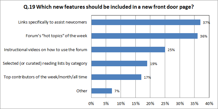
You remember perhaps that we asked about the possible new front door in the user survey (more information about the user survey is here: forum.susana.org/forum/categories/10-ann...survey-now-available):
Enough people asked for a new front door page to make it worthwhile. Of the listed features (see the second graph), we have been able to implement all, except for the instructional video. That will come in early 2015 hopefully.
The main idea with the new front door page is to help newcomers to orientate themselves. They should easily get a grasp of what is going on and how this page connects with the wider SuSanA platform, i.e. the website, flickr database, twitter* etc.
For the benefit of newcomers, the new front door page will provide links to key documents (see my other post here:
forum.susana.org/forum/categories/10-gen...d-sub-category-level )
There is only one disadvantage about the new front door (for experienced users): it takes one extra click to get inside. But to overcome that, you can make yourself a shortcut to the URL that goes to the "Recent topics" page, i.e. the current landing page.
For a sneak preview of the new front door, click on this link:
forum.susana.org/frontdoor3
And one more thing related to the new front door: We have given the forum page itself a bit of a facelift with the intention to give it a more similar "look & feel" to the new SuSanA website (www.susana.org). For example, we have removed the green bars from the page - see a sneak preview here:
forum.susana.org/forum?template=susana_forum_v14
For frequent users, it takes a little bit of getting used to but I think we will soon enjoy this cleaner, fresher look.
The launch of the new front door will happen probably this week still.
We hope you like it and - as always - we are looking forward to your feedback and further suggestions!
Kind regards,
Elisabeth
(with Arno, Steffen, Trevor and Shobana who were all involved in the development of this)
* A twitter feed is embedded in the new front door page and any tweet mentioning @susana_org will be shown in this feed-
Dr. Elisabeth von Muench
Freelance consultant on environmental and climate projects
Freelance consultant on environmental and climate projects
Attachments:
-
 Question18.png
(Filesize: 9KB)
-
 Question19.png
(Filesize: 12KB)
The following user(s) like this post: jankn
You need to login to reply
The topic has been locked.
Share this thread:
- Forum
- categories
- Announcements and miscellaneous
- General announcements
- Announcements and discussions regarding SuSanA
- Our Forum got a new front door page (and new layout inside)!
Recently active users. Who else has been active?
Time to create page: 0.159 seconds

