- Forum
- categories
- Markets, finance and governance
- Market development in action
- Finding a new icon for our grey category on markets, finance and governance - conclusion reached
Finding a new icon for our grey category on markets, finance and governance - conclusion reached
29.5k views
- Elisabeth
-
- User is blocked
- Freelance consultant since 2012
Less- Posts: 3372
- Karma: 54
- Likes received: 932
Re: Finding a new icon for our grey category on markets, finance and governance
You might have noticed that the new icon for our "grey" category (markets, finance and governance) has now been implemented. You should see it in the top row, but if the old one is still there you might have to refresh the page by using the F5 key.
This is what the new icon looks like:
I hope you all like it.
Dear Hajo,
Sorry for "disregarding" your last minute suggestion on this one. Some comments:
Again, thanks everyone for your inputs! This was a truly participatory process, I think. It took a while (we started this thread in July 2015) but I think we can be proud of the end result.
Regards,
Elisabeth
P.S. I've also put the file here in case you want to use it for another purpose (just download it from here):
www.flickr.com/photos/gtzecosan/24485701...n/dateposted-public/
This is what the new icon looks like:
I hope you all like it.
Dear Hajo,
Sorry for "disregarding" your last minute suggestion on this one. Some comments:
- Yes, the term "governance" is still part of the category title - this was agreed on a little while ago and there was no intention (anymore) to drop it.
- Yes, the pie format breaks our rule of only having two parts to the icon. Now we have made an exception and have three but it seemed impossible to represent it well otherwise.
- I think just showing cash is not enough to symbolise "market development". The cash in the icon is meant to represent more the "financing" aspect but not all the things that are in market development - which is meant to be represented by the shopping trolley.
- The government building at the bottom of the icon underpins everything in the form of "governance"; it also includes global political processes, government as a driver, city planning, monitoring and evaluation.
- The shopping trolley represents the markets, market development, trading, marketing, sanitation as a business and so forth.
- The cash represents financing, money changing hands, willingness to pay, mirco-finance, taxes, tariffs etc.
- The "pie chart" says that the three elements have to work hand in hand together.
Again, thanks everyone for your inputs! This was a truly participatory process, I think. It took a while (we started this thread in July 2015) but I think we can be proud of the end result.
Regards,
Elisabeth
P.S. I've also put the file here in case you want to use it for another purpose (just download it from here):
www.flickr.com/photos/gtzecosan/24485701...n/dateposted-public/
Dr. Elisabeth von Muench
Freelance consultant on environmental and climate projects
Freelance consultant on environmental and climate projects
Attachments:
-
 icon_marke...rter.jpg
(Filesize: 5KB)
Please Log in to join the conversation.
You need to login to reply- jonpar
-
- As part of the Engineering team, my role at IMC is to lead on the delivery of projects requiring specific expertise on urban sanitation (including excreta/waste/wastewater/stormwater management) focusing on technical, institutional and financial aspects in project design and implementation.
Less- Posts: 223
- Karma: 24
- Likes received: 87
Re: Finding a new icon for our grey category on markets, finance and governance
I too like Option 8a. Let's stick with this. Well done to Elisabeth and Genevieve.
Dr. Jonathan Parkinson
Principal Consultant – Water and Sanitation
IMC Worldwide Ltd, Redhill, United Kingdom
Email: This email address is being protected from spambots. You need JavaScript enabled to view it.
Skype : jonathanparkinson1
Principal Consultant – Water and Sanitation
IMC Worldwide Ltd, Redhill, United Kingdom
Email: This email address is being protected from spambots. You need JavaScript enabled to view it.
Skype : jonathanparkinson1
Please Log in to join the conversation.
You need to login to reply- hajo
-

- retired in Germany... but still interested in water and sanitation... especially in OSS... and especially in Africa...
Less- Posts: 288
- Karma: 15
- Likes received: 156
Re: Finding a new icon for our grey category on markets, finance and governance
hi all,
sorry, I stumbled over this thread by 'accident' and could not understand why the discussion was started. I find the existing logo appropriate and would also insist that 'governance' stays in the logo name as for me markets will neither develop nor function without proper governance.
And the pie format seems to me a 'trick' to deviate from the agreement to have only 2 symbols in each logo...
Money for me represents well 'markets' and 'finance'. I could agree to replace the $ with some money symbols as proposed in option 8a.
Sorry, for boiling up the discussion again which seemed to settle down just...
ciao Hajo
We can't solve problems by using the same kind of thinking we used when we created them.
Albert Einstein
Any intelligent fool can make things bigger and more complex... It takes a touch of a genius - and a lot of courage to move in the opposite direction.
E.F. Schumacher
Everything should be made as simple as possible, but not simpler.
Albert Einstein
Albert Einstein
Any intelligent fool can make things bigger and more complex... It takes a touch of a genius - and a lot of courage to move in the opposite direction.
E.F. Schumacher
Everything should be made as simple as possible, but not simpler.
Albert Einstein
Please Log in to join the conversation.
You need to login to reply- Elisabeth
-
- User is blocked
- Freelance consultant since 2012
Less- Posts: 3372
- Karma: 54
- Likes received: 932
Re: Finding a new icon for our grey category on markets, finance and governance
So, I think we can pretty much finalise this now - yay!!
I've asked Steffen Eisser (who did the other icons for us) to convert the icon proposals into the same "style" as we have for the other icons.
Therefore, I would now like to propose this as the final version for this category on markets, finance and governance:
Option 8a:
My original thinking was that I don't like the shopping trolley and prefer the market stall to symbolise "market". But when I look at the possible icon, this doesn't look as good - too many stripes, too difficult to recognise the market stall easily (I call this Option 9a):
And here are some alternatives to symbolise the money part:
Option 8b:
Option 9b:
So I am suggesting to use Option 8a. What do you all think? If I don't hear violent objections, or really good easy to realise alternatives in the next 4 days, then I will get Steffen to replace the grey icon at the top menu bar with this one. Are you generally OK with using the shopping trolley as a symbol here despite its drawbacks? I guess it is nowadays quite widely recognised for shopping, e.g. on internet shopping it is often used as a symbol to put things into one's basket.
Thanks to Genevieve Kelly and Jonathan Parkinson for pushing this forward (we exchanged a few e-mails on this)!
Elisabeth
P.S. As a reminder, the current icon for the grey category looks like this:
It is not reflecting very well the market development side and therefore we want to improve it. I also don't like the simple dollar sign to reflect money/cash/financing.
Dr. Elisabeth von Muench
Freelance consultant on environmental and climate projects
Freelance consultant on environmental and climate projects
Attachments:
-
 Option1a.jpg.png
(Filesize: 22KB)
-
 Option1b.png
(Filesize: 17KB)
-
 Option2a.png
(Filesize: 21KB)
-
 Option2b.png
(Filesize: 21KB)
Please Log in to join the conversation.
You need to login to reply- AdaOkoWilliams
-
 Less
Less- Posts: 10
- Karma: 2
- Likes received: 10
Re: Finding a new icon for our grey category on markets, finance and governance
Great we are making some progress with this. I like the money and government symbols in the image Jonathan attached, but the stall  as i think the sanitation market is beyond goods but includes services too.
I haven't been very helpful i see as i am not suggesting another logo. I prefer putting all three elements in the pie frame.
I haven't been very helpful i see as i am not suggesting another logo. I prefer putting all three elements in the pie frame.
Please Log in to join the conversation.
You need to login to reply- jonpar
-
- As part of the Engineering team, my role at IMC is to lead on the delivery of projects requiring specific expertise on urban sanitation (including excreta/waste/wastewater/stormwater management) focusing on technical, institutional and financial aspects in project design and implementation.
Less- Posts: 223
- Karma: 24
- Likes received: 87
Re: Why the name change from formerly Business & Governance category to Market Development? - And new icon
Hi - I;m not so keen on the image for the market I prefer the one attached or the shopping trolley I think is good... I also prefer the money in the image attached rather than the image in the version above.. I'm not exactly sure what it is to be be honest.. so this is what I came up with.. Jonathan
Dr. Jonathan Parkinson
Principal Consultant – Water and Sanitation
IMC Worldwide Ltd, Redhill, United Kingdom
Email: This email address is being protected from spambots. You need JavaScript enabled to view it.
Skype : jonathanparkinson1
Principal Consultant – Water and Sanitation
IMC Worldwide Ltd, Redhill, United Kingdom
Email: This email address is being protected from spambots. You need JavaScript enabled to view it.
Skype : jonathanparkinson1
Attachments:
-
susanalogo...kets.JPG (Filesize: 16KB)
Please Log in to join the conversation.
You need to login to reply- Elisabeth
-
- User is blocked
- Freelance consultant since 2012
Less- Posts: 3372
- Karma: 54
- Likes received: 932
Re: Why the name change from formerly Business & Governance category to Market Development? - And new icon
Hi Jonathan and all,
I totally agree with you (by the way, there was one more post after your post from 25 Nov, i.e. the one from Ada on 30 Nov above yours).
Like you, I would really like to come to a conclusion now regarding the new icon. Trouble is, it's so difficult... But let me propose an executive decision: I have botched up the one below in powerpoint - if it's agreed by people then I would ask our designer (or the designer at PSI) to make it look pretty and completely in grey and white, not in black.
I also attach the file and the ppt file below in case someone needs it.
My thinking behind this proposal:
It takes this 3-wedge pie chart that Genevieve had suggested above, and puts in there, as Genevieve had written:
For the marketplace symbol I suggest the one with the simple market stall. I have removed the apples on display to make the overall icon simpler. If needed, some basic shapes could be in there which don't look like anything in particular (e.g. if I cut down the apples which used to be there on the display shelf in the middle, they look like some dishes).
For the government symbol I have retained that stately building - couldn't think of a better one. Ada had suggested a flag on it but I think that would add too much complexity.
For the money symbol, I used two notes (could also use a stack of notes of coins) - important that neither the dollar symbol nor any other particular currency symbol is shown, I think, to make it more "universal".
I put the government symbol at the bottom because it fits nicely with the triangular shape of the wedge but also because government and governance has the capacity to "underpin" it all with regulations, policies and so forth.
If this suggestion is met with approval (in principal) then I would go ahead and give the job to one of our designers (either Steffen Eisser or the one at PSI if she has time, or anyone else who might volunteer) to make it look pretty and neat.
If you have an alternative suggestion or ideas for small incremental improvements, please put them here in the next few days. If I don't hear anything to the contrary, I will go ahead after 26 December with this.
Oh, and one negative I see with my proposal: it makes the icon rather complex, compared to our other category icons. But I don't see a better solution at this stage. Markets, finance and governance is complex to represent in one icon...
Cheers,
Elisabeth
I totally agree with you (by the way, there was one more post after your post from 25 Nov, i.e. the one from Ada on 30 Nov above yours).
Like you, I would really like to come to a conclusion now regarding the new icon. Trouble is, it's so difficult... But let me propose an executive decision: I have botched up the one below in powerpoint - if it's agreed by people then I would ask our designer (or the designer at PSI) to make it look pretty and completely in grey and white, not in black.
I also attach the file and the ppt file below in case someone needs it.
My thinking behind this proposal:
It takes this 3-wedge pie chart that Genevieve had suggested above, and puts in there, as Genevieve had written:
We could overlay each wedge with a marketplace symbol, a government symbol and a money symbol to show how the 3 work together?
For the marketplace symbol I suggest the one with the simple market stall. I have removed the apples on display to make the overall icon simpler. If needed, some basic shapes could be in there which don't look like anything in particular (e.g. if I cut down the apples which used to be there on the display shelf in the middle, they look like some dishes).
For the government symbol I have retained that stately building - couldn't think of a better one. Ada had suggested a flag on it but I think that would add too much complexity.
For the money symbol, I used two notes (could also use a stack of notes of coins) - important that neither the dollar symbol nor any other particular currency symbol is shown, I think, to make it more "universal".
I put the government symbol at the bottom because it fits nicely with the triangular shape of the wedge but also because government and governance has the capacity to "underpin" it all with regulations, policies and so forth.
If this suggestion is met with approval (in principal) then I would go ahead and give the job to one of our designers (either Steffen Eisser or the one at PSI if she has time, or anyone else who might volunteer) to make it look pretty and neat.
If you have an alternative suggestion or ideas for small incremental improvements, please put them here in the next few days. If I don't hear anything to the contrary, I will go ahead after 26 December with this.
Oh, and one negative I see with my proposal: it makes the icon rather complex, compared to our other category icons. But I don't see a better solution at this stage. Markets, finance and governance is complex to represent in one icon...
Cheers,
Elisabeth
Dr. Elisabeth von Muench
Freelance consultant on environmental and climate projects
Freelance consultant on environmental and climate projects
Attachments:
-
 greyiconsketch.jpg
(Filesize: 23KB)
-
 greyiconsketch.jpg
(Filesize: 23KB)
Please Log in to join the conversation.
You need to login to reply- jonpar
-
- As part of the Engineering team, my role at IMC is to lead on the delivery of projects requiring specific expertise on urban sanitation (including excreta/waste/wastewater/stormwater management) focusing on technical, institutional and financial aspects in project design and implementation.
Less- Posts: 223
- Karma: 24
- Likes received: 87
Re: Why the name change from formerly Business & Governance category to Market Development? - And new icon
Hello - there's been no further posting to the Forum about this since my posting on 25.11 .. what is the process to bring this to closure and conclude the selection of the logo ? Jonathan
Dr. Jonathan Parkinson
Principal Consultant – Water and Sanitation
IMC Worldwide Ltd, Redhill, United Kingdom
Email: This email address is being protected from spambots. You need JavaScript enabled to view it.
Skype : jonathanparkinson1
Principal Consultant – Water and Sanitation
IMC Worldwide Ltd, Redhill, United Kingdom
Email: This email address is being protected from spambots. You need JavaScript enabled to view it.
Skype : jonathanparkinson1
Please Log in to join the conversation.
You need to login to reply- AdaOkoWilliams
-
 Less
Less- Posts: 10
- Karma: 2
- Likes received: 10
Re: Why the name change from formerly Business & Governance category to Market Development? - And new icon
My first take is with the dollar sign and the rupee sign for that matter, as much as the US dollar is almost the universal currency I would rather we had a wad of notes and coins by the side or a depiction of sales like two people exchanging notes.
For governments, I think the building with the pillars is kind of universal and often used to depict governments. For a change we might consider one with a flag on it.
If we can have a design that depicts people, money and governments it should capture the essence of markets development.
Icon no.5 , the pie chart is simple and presents me the platform for the three key components as mentioned above to fit nicely.
Thank you Genevieve and your team at PSI for all of the very brilliant ideas already shared.
Kindly,
Ada
Please Log in to join the conversation.
You need to login to reply- jonpar
-
- As part of the Engineering team, my role at IMC is to lead on the delivery of projects requiring specific expertise on urban sanitation (including excreta/waste/wastewater/stormwater management) focusing on technical, institutional and financial aspects in project design and implementation.
Less- Posts: 223
- Karma: 24
- Likes received: 87
Re: Why the name change from formerly Business & Governance category to Market Development? - And new icon
Hello everybody, I've been negligent on this and I just looked at this discussion. How about a shopping trolley (similar to #6 in the first set) but with a toilet inside it instead of the government symbol represented by the Parthenon? I think that could be quite good but we would then lose the 'governance' part of "Markets, finance and governance". So - maybe not. I'm not sure - I've not seen any logo that jumped out at me as being the one. best regards, Jonathan
Dr. Jonathan Parkinson
Principal Consultant – Water and Sanitation
IMC Worldwide Ltd, Redhill, United Kingdom
Email: This email address is being protected from spambots. You need JavaScript enabled to view it.
Skype : jonathanparkinson1
Principal Consultant – Water and Sanitation
IMC Worldwide Ltd, Redhill, United Kingdom
Email: This email address is being protected from spambots. You need JavaScript enabled to view it.
Skype : jonathanparkinson1
Please Log in to join the conversation.
You need to login to reply- milli
-

- I am working in the field of environmental and sustainability issues, professionally and privately. Waste and wastewater are some of my main topics.
Less- Posts: 30
- Karma: 2
- Likes received: 6
Re: Why the name change from formerly Business & Governance category to Market Development? - And new icon
Dear Genevieve and everybody else,
thanks for putting together those new ideas.
Me personally, I like the market place icon as a symbol for the market. I prefer the second market place symbol (not necessarily with the apples ) to the first one (better recognizable).
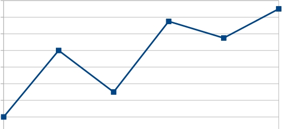
Concerning the stock development arrow I am undecided. I agree with the problematic association with unlimited growth. But the solution to put it beneath the market place symbol seems ok to me. Also, the arrow looks for me like a lightning bolt. Maybe the symbol could be changed into a kind of increasing line diagram without an arrow?
this is just to get an idea what I mean. It would have to be converted into an icon.
The rupee sign instead of a dollar sign is a good alternative too.
Best regards,
milli
thanks for putting together those new ideas.
Me personally, I like the market place icon as a symbol for the market. I prefer the second market place symbol (not necessarily with the apples
Concerning the stock development arrow I am undecided. I agree with the problematic association with unlimited growth. But the solution to put it beneath the market place symbol seems ok to me. Also, the arrow looks for me like a lightning bolt. Maybe the symbol could be changed into a kind of increasing line diagram without an arrow?
this is just to get an idea what I mean. It would have to be converted into an icon.
The rupee sign instead of a dollar sign is a good alternative too.
Best regards,
milli
Danijela Milosevic
M.Sc. Environmental and Resource Management
Gießen, Germany
M.Sc. Environmental and Resource Management
Gießen, Germany
Attachments:
-
 graph.jpg
(Filesize: 25KB)
Please Log in to join the conversation.
You need to login to reply- kengelly
-
 Topic AuthorLess
- Posts: 38
- Karma: 4
- Likes received: 11
Re: Why the name change from formerly Business & Governance category to Market Development? - And new icon
Hi Milli,
Your summary is SO helpful! And my sincere apologies for neglecting this thread the past few months.
With regard to some of the feedback and to perhaps make things a bit simpler, I'm not sure we necessarily have to make our icon include something sanitation-specific, given that the context of it being on Susana.org already includes sanitation. This icon need not stand alone outside of this forum. Most of the icons do not have sanitation-specific references and I think this will be helpful to remember as we try to land this concept!
Interestingly enough, a lot of the challenge is of course "how do we define market development for sanitation? If we agree that it involves "markets, finance and governments" working together, we could take a collaboration approach to the icon - such as various actors working together, interconnectedness etc. which may help us to escape some of the US or capitalism-themed icons thus far. (Side note, I'd argue that the current name of the subgroup is a misnomer -- that in fact finance and governments are part of the broader market, even though they may not be always be actors.. they're influencers.)
A few I've come across a few open-source icons (and I'd highly encourage everyone to check out "thenounproject.com" if they're interested in exploring further) that we could look at to add to the conversation.
What I'm hearing is that the market symbol is liked (possibly overlaid with an arrow) and that would effectively combine the top favorites, icons #2 and #5. I've yet to find a stock version of this, unfortunately, but if anyone is savvy with illustrator (or if we decide this is exactly what we need I can ask our PSI graphic designer if she has the time to develop the final concept) we could try to make it!
A few others to add to the mix:
1. To demonstrate collaboration by multiple actors
2. We could replace the apples with poops, or toilets
3. We could replace the dollar sign with a rupee sign to make it less US-focused
4. Put a skirt on the person and then you can see a person pushing things to "function" in a way
5. We could overlay each wedge with a marketplace symbol, a government symbol and a money symbol to show how the 3 work together? (USAID, for example, demonstrates market development with a 3-piece pie chart to show supply, demand and the enabling environment working together as one.)
Unrelated, how neat is this one, for the resource-recovery subgroup?
Apologies to only add to the mix, but thought maybe we could take a refresh.
Another idea (for which we'd have to develop a new icon) is that we have the government symbol that is in the current icon sat next to a marketplace and in front of them you see that rising arrow to demonstrate growth.
Best,
Genevieve
Genevieve Kelly
Graduate Student | MBA & MPH
Johns Hopkins University
Baltimore, MD USA | tel: 570-854-5075 skype: kengelly
This email address is being protected from spambots. You need JavaScript enabled to view it.
Graduate Student | MBA & MPH
Johns Hopkins University
Baltimore, MD USA | tel: 570-854-5075 skype: kengelly
This email address is being protected from spambots. You need JavaScript enabled to view it.
Attachments:
-
 noun_54119_cc.png
(Filesize: 44KB)
-
 noun_13611.png
(Filesize: 30KB)
-
 noun_175564_cc.png
(Filesize: 22KB)
-
 noun_195833_cc.png
(Filesize: 20KB)
-
 noun_54671_cc.png
(Filesize: 20KB)
-
 noun_204651_cc.png
(Filesize: 22KB)
Please Log in to join the conversation.
You need to login to reply
Share this thread:
- Forum
- categories
- Markets, finance and governance
- Market development in action
- Finding a new icon for our grey category on markets, finance and governance - conclusion reached
Recently active users. Who else has been active?
Time to create page: 0.718 seconds


