


- Forum
- categories
- Announcements and miscellaneous
- General announcements
- Announcements and discussions regarding SuSanA
- Our Forum got a new front door page (and new layout inside)!
Our Forum got a new front door page (and new layout inside)!
22k views
- Elisabeth
-
Topic Author
- User is blocked
- Freelance consultant since 2012
Less- Posts: 3372
- Karma: 54
- Likes received: 932
Re: Our Forum got a new front door page (and new layout inside)!
In my post from 15 December above I had mentioned a few issues that I would discuss with our IT developer. Now I want to give you some feedback on what he said:
About the front door page (www.forum.susana.org)
I had written about the access from mobile versions:
Steffen told me that this would be very complex to program and would require a few thousand Euros worth of his programming time. For this reason, we already way back opted for a separate page for mobile device users (with the URL: m.forum.susana.org) so that the users can choose if they want to view the desktop or the mobile version.Regarding making the page dynamically resize if someone views it from a mobile device, I will have to check with Steffen on that one as I don't know how complex this would be.
I had written about the two boxes that appear below the categories on the front page:
Steffen has made the box with "Tweets mentioning SuSanA" a bit wider now. The second one of top contributors has equal width but is centred so you can't really see the width.It's true, they are less wide. The first one about the tweets is probably a plug-in and could be made wider (I will ask Steffen). The second one, I guess is centred as there is not so much text there. But I also wonder if we need that grey bar behind "Recent topics by category"; "Most active topics past."
About the grey horizontal bar behind those two boxes, he felt that these grey bars help to recognise the similarities with the SuSanA website. That and the type of font and colours chosen shows the connection between the two, he pointed out.
I wrote about the issue of vertical distances and "white spaces":
Steffen has now reduced the vertical distance between the categories and the "Recent topics" box a bit. If he reduces it further then it might look rather cramped when the hover texts of the category icons are visible.I was told by our web designer (Steffen) that most pages nowadays are becoming geared towards mobile devices, and therefore users are used to scrolling down. But I can ask him to reduce the vertical gap so that people realise there is more.
I wrote (about the numbers that appear in the list of "top contributors"):
No change has been made here yet, as I am thinking it is quite self-explanatory, and not that important to warrant additional hover text (?).The numbers in green and blue signify the number of posts someone has made in that time period and the number of likes someone has received in that time period. Does that need to be made clearer and if yes, how?
About the inner page of the forum (forum.susana.org/forum)
I wrote about the vertical space that the fixed top part takes up:
This comes back to the issue of a website looking "cramped" versus looking a bit generous with space. Here I am not sure if that's just the opinion of some few users or if more users feel that there is too much empty space? We will keep pondering about that one. Now that the marquee is not there (we only turn it on for special occasions), it does look like a rather large space there.Wow, that's a lot. Perhaps you have the font size set to very large? On my screen the fixed part occupies only about one quarter of the screen. But I agree that the marquee might be taking up too much of the vertical space. Will speak to Steffen about that.
I wrote about a possible "animation" of the category icons:
This has now been implemented. Do you like it?About the animation (i.e. the icons getting bigger when you hover over them, I will ask Steffen). Could be good.
About ensuring that the forum pages and the SuSanA website have a more similar look & feel to them, this is something we will continue to ponder over in the new year. So far we haven't had any bright ideas for simple changes that could make that happen. In any case, I think it is important that there are clear buttons to get from the forum page to the SuSanA website (see at the top left) and vice versa. That's important.
Kind regards,
Elisabeth
P.S. For any of you who are using twitter: Make sure you include @susana_org in your tweets more often than not, because then your tweet will automatically appear on the front page of the forum (at the bottom left), thus giving your tweet more exposure and more chance of a re-tweet.
Edit in June 2018: We removed the "front door" page of the forum in mid 2017 as it was causing too much confusion.
Freelance consultant on environmental and climate projects
- Elisabeth
-
Topic Author
- User is blocked
- Freelance consultant since 2012
Less- Posts: 3372
- Karma: 54
- Likes received: 932
Re: Our Forum got a new front door page (and new layout inside)!
") Thank you.
Thank you.I would love to see more people saying something about SuSanA. (I see SuSanA mentioned sometimes when somebody credits a photo from the SuSanA Flickr database in their blog post for example in this case: www.devex.com/news/how-to-eliminate-open...cation-by-2030-84634 . It always brings a smile to my face.)
If we find more information about SuSanA written by others, then I would also like to include that into the Wikipedia article on SuSanA - which is meant to be written objectively, not by someone who is active in it, like me:
en.wikipedia.org/wiki/Sustainable_Sanitation_Alliance
(you can see on the Talk page that I was once criticised for writing about SuSanA on Wikipedia as I might have a conflict of interest:
en.wikipedia.org/wiki/Talk:Sustainable_Sanitation_Alliance)
Regards,
Elisabeth
Freelance consultant on environmental and climate projects
- F H Mughal
-

- Senior Water and Sanitation Engineer
Less- Posts: 1026
- Karma: 20
- Likes received: 227

Re: Our Forum got a new front door page (and new layout inside)!
Regarding the second part, yes, I once came across SuSanA reference, but now, I would not know where. In future, I will track that, and will let you know.
Shouldn't you be making this request to all users, rather than to me only? Others have super fast computers and internet connection. I, on the other hand, have slow and unstable connection. That would suggest that, other users are more well-placed to come across the SuSanA reference. I will, however, do my part.
Smiles,
F H Mughal
Karachi, Pakistan
- Elisabeth
-
Topic Author
- User is blocked
- Freelance consultant since 2012
Less- Posts: 3372
- Karma: 54
- Likes received: 932
Re: Our Forum got a new front door page (and new layout inside)!
Dear Mughal,
The user has the option of selecting which time period he/she wants to view for those statistics. They are these blue words in square brackets (they become green when you choose them) - in the second half of the front door page (www.forum.susana.org or click at the top left on the SuSanA Forum logo):
Most active topics
[week] [month] [all time]
Do you see now what I mean? Is there an alternative way to make this clearer?
About SuSanA being mentioned by other organizations: Oh, yes that would be awesome if that happens and if people bring that to our attention by making a forum post about it. I would say at this stage, such a mention is probably quite rare so having it displayed on the front door would look a bit boring as not much would be changing from one week to the next. Or have you seen SuSanA mentioned in other people's newsletters more often? If you do, please bring it to our attention by making a forum post about it. Thanks a lot.
Regards,
Elisabeth
Freelance consultant on environmental and climate projects
- F H Mughal
-
- Senior Water and Sanitation Engineer
Less- Posts: 1026
- Karma: 20
- Likes received: 227
Re: Our Forum got a new front door page (and new layout inside)!
I'm still unclear by those numbers in green and blue. You say: "in that time period." What is - "in that time period?"
About - "SuSana mentioned or referred to, in the posts of other organizations."
Let me explain this with an example. Suppose in AIT newsletter, there is a useful and interesting aspect attributed to SuSana; this then should be reflect - what AIT newsletter says about SuSana.
The idea is to show how important and popular SuSana is - it is getting attention in other organizations' posts. I'm not sure, whether it can be automated. You IT guru can figure it out.
Can't you have a manual system for this?
Clear now?
Smiles,
F H Mughal
Karachi, Pakistan
- Elisabeth
-
Topic Author
- User is blocked
- Freelance consultant since 2012
Less- Posts: 3372
- Karma: 54
- Likes received: 932
Re: Our Forum got a new front door page (and new layout inside)!
Both belong to the same overarching platform, yes.
What we tried to do is to create a front door for the forum, not a front door for the entire SuSanA platform (maybe we in fact need such a platform frontdoor? Or I guess that is the front page of the SuSanA website; where - by the way - the link to the forum could also be made more obvious).
So in my opinion the forum front door should link to the SuSanA website, yes. Even look similar, yes (we tried to do that with the choice of colours and fonts). But not somehow replicate the website with e.g. the same black menu bar on the top, same photo in the background. When I come to the forum front door, I don't want to see links to working groups, partners, events. If I want that, I should go to the SuSanA website.
But as we have the same designer for the website as for the forum front door (Steffen), I will consult with him to see which design elements could easily be repeated to make it look more similar than it is now.
Keep your comments going, this is exactly what I was looking forward to when we launched the new front door.
Regards,
Elisabeth
Freelance consultant on environmental and climate projects
Re: Our Forum got a new front door page (and new layout inside)!
muench wrote: to give them a similar "look & feel", they are still two different things.
Well, at the moment the impression is clearly that they are different things. If you want to change that, I think both start pages/front doors of SuSanA website and forum should have some design elements in common.
Personally I think the forum and the website shouldn't appear as different things, but the forum should appear as part of the SuSanA website. Having the forum front door in the same layout as the website would be an easy way to do this.
What do you have in mind there? I can only think of the category structure, there is no other structure?
forum.susana.org/forum/categories
Yes, this is what I mean. Perhaps I managed to overlook it, but I think it would be good to have a link to that view on the front door as well.
- Elisabeth
-
Topic Author
- User is blocked
- Freelance consultant since 2012
Less- Posts: 3372
- Karma: 54
- Likes received: 932
Re: Our Forum got a new front door page (and new layout inside)!
Ah, interesting suggestion, thanks for providing this sketch! I had also tossed around ideas with Trevor to make the forum front door page look more similar to the SuSanA website front page. The idea of using the photo of the Asian landscape had also crossed my mind. However, this picture should actually be rotated with the other photos from the front page (e.g. click on that box called "knowledge hub") - a feature which is soon to be implemented, Trevor told me. Also, it can be misleading to think that one photo can somehow "represent" the entire content of the forum (why single out a rural landscape in China above all others?).
Also, repeating the black menu bar from the SuSanA website onto the forum front door makes no sense in my view. Whilst I have no problem with trying to give them a similar "look & feel", they are still two different things. Having menu items of the website on the front door of the forum is very confusing and adds "clutter".
However, in general, anything is possible... I personally like the "clean" empty look of the Forum front door (text on white background) - which by the way equals the lower part of the front page of the SuSanA website.
But that's just my personal opinion, I am very happy to have more exchanges with you and others to find the optimal solution for this.
And you also said:
What do you have in mind there? I can only think of the category structure, there is no other structure?Is there a button that displays the full forum structure?
forum.susana.org/forum/categories
The same structure is by the way now also visible on the key documents page (which I am currently building up - work in progress):
forum.susana.org/key-documents
Regards,
Elisabeth
Freelance consultant on environmental and climate projects
Re: Our Forum got a new front door page (and new layout inside)!
just two comments:
1) I do agree that the front page (and the main forum) are not intuitively recognisable as part of the SuSanA website. The only thing both pages have in common is the rather discreet SuSanA logo. I also don't find the design of the front door particularly appealing (while the functions and content are fine). Why not use simply the nice look of the SuSanA start page, e.g. take the same Asian landscape image as background and place the boxes with content in front of it... The page could have the search box and the link to the forum on the left side, the category icons on the right side, and the feeds below, and then would look very similar to the main side. You could even keep the black bar of the SuSanA page on the top...
Here some quick copy paste on how I imagine this could look like:
2) Is there a button, that displays the full forum structure? I only found the category buttons, displaying only parts of the forum. I guess newcomers would be interested to have a look at the entire structure for exploring the forum...
Regards,
Florian
Attachments:
-
Vollbildau...1402.jpg
(Filesize: 49KB)
- Elisabeth
-
Topic Author
- User is blocked
- Freelance consultant since 2012
Less- Posts: 3372
- Karma: 54
- Likes received: 932
Re: Our Forum got a new front door page (and new layout inside)!
Thank you all for your feedback on the new front door page. It is much appreciated, as we can only improve when we get your feedback. Let's hear also from our "silent" members and from newcomers, as this page is particularly geared towards them?
I mean this new front door page:
www.forum.susana.org
Now I will try to address the feedback received so far from Dorothee, Mughal, Christoph and Kris grouped by topic.
Frontdoor, for mobile devices:
Dorothee said:
- The way the page is structured looks like particularly adapted to mobile and table users. My question is, do we still have the mobile version or will we have only one in the future. If we have two separate, I would suggest to squeeze/rearrange a bit the header in order to make space for the category icons: they are only partly visible on my screen except when I scroll down a bit.
and Kris said:
Even though (as Dorothee has suggested) the front door seems geared toward mobile devices, it does not actually dynamically resize according to screen resolution ("responsive design"). This makes the writing very hard to read on mobile devices and/or you need to pan sideways quite a bit all the time. This is maybe a work in progress?
We have not yet worked on a front door for the mobile version (mobile version's website is: www.m.forum.susana.org and it's for viewing the page on tablets or mobile phones). I am not yet sure if the mobile version will also need to have a front door - as not so many people are using the mobile version yet (see survey results) one has to wonder how much time to invest into it.
Regarding making the page dynamically resize if someone views it from a mobile device, I will have to check with Steffen* on that one as I don't know how complex this would be.
Front door, in general:
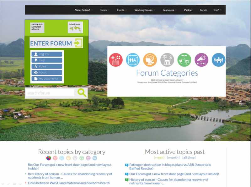
- I do not understand why the 4 boxes "Recent topics by category"; "Most active topics past"; "Tweets mentioning SuSanA"; "Top contributors" dont have the same layout: last two seem less wide on my screen.
It's true, they are less wide. The first one about the tweets is probably a plug-in and could be made wider (I will ask Steffen). The second one, I guess is centred as there is not so much text there. But I also wonder if we need that grey bar behind "Recent topics by category"; "Most active topics past."
I don´t understand why to make the entry so large that it appears to cover the screen. Only by Dorothees post I understood that there is more than just the icon. I had a quick look on the first screen and did not notice that there is more to scroll down. Nowadays scroll down on an entry page .... (our web designer said when we restructured our page) that is a nogo!
I was told by our web designer (Steffen) that most pages nowadays are becoming geared towards mobile devices, and therefore users are used to scrolling down. But I can ask him to reduce the vertical gap so that people realise there is more. (then again he told me one should not make a page look too crowded but be generous with the empty spaces!?).
I think the icons are way too large. Opening the recent posts page, more than half of the page (13’ screen) is occupied by fix information I do not use as an experienced user. As well the blue bar with the moving yellow could be in the same line with post a new topic, therefore diminishing a lot the use of space.
Wow, that's a lot. Perhaps you have the font size set to very large? On my screen the fixed part occupies only about one quarter of the screen. But I agree that the marquee might be taking up too much of the vertical space. Will speak to Steffen about that.
That's what those faded out little round icons are for. But I will ask Steffen if it can be made more obvious (maybe with a hover text?)"Recent topics by category," is a bit confusing. It appears, they all belong to one category - at least that is what a new user will understand. Show here the categories, so that the users can easily comprehend.
The user can select (see text in green just below the heading; which should probably be made bold as well) if it should be the past week, month or all time."Most topics active past," - again this is not quite clear. Do you mean most topics active during the past one month? If yes, then say so, and; what is the criteria? Is it the maximum number of posts received?
Yes, it is the number of posts received in that thread during that time period.
I am not sure how to make that clearer without adding additional text?
We wanted to do also a "most popular thread" which would factor in that likes received in that thread but we haven't yet been able to program that. Hoping to do that next year.
We put the "past" at the end because in the next line we have: week, month, all time. It should be read together. However, perhaps we can just delete the "past" and make the green text for week, month, all time more visible (in bold)"Top contributors past," may be changed to top past contributors. And, what those numbers in green and blue signify?
The numbers in green and blue signify the number of posts someone has made in that time period and the number of likes someone has received in that time period. Does that need to be made clearer and if yes, how?
I don't understand what you mean here and how this could be automated? The twitter feeds are automated, i.e. whenever someone puts @susana_org in a tweet, it will be in the twitter box.Please have something like - "SuSana mentioned or referred to, in the posts of other organizations."
New look:
About the animation (i.e. the icons getting bigger when you hover over them, I will ask Steffen). Could be good.- I find the Icons in the header and the respective titles two small (can we have the same animation like on the front door?).
Well, if you have ideas on making it more recognisable that the two belong together, then please tell me.- I am also not sure if the recognition factor to the SuSanA main homepage is sufficient?
Hmm, well, not sure. Which colour would you suggest instead of the yellow? White?- Does the text in the announcement bar header really have to be yellow? As the whole thing is moving it is attracting attention enough, isn't it?
Forum digest
This comment came from Christoph. I didn't know what he meant at first but we found out he is using the very old forum digest that runs via Feedburner (that's Option 2 here: forum.susana.org/forum/subscribe). It is used by 230 people and we created it for people who are not SuSanA members. Anyway, there is a SuSanA logo in there and we can easily change it so that clicking on that logo would take you to the recent topics page, not the front door page. That's no problem. But I generally advise all SuSanA members to use the normal forum digest, i.e. Option 1 here: forum.susana.org/forum/subscribe where you can also select your desired frequency).As somebody who uses the forum a bit it is annoying to have to click twice when you come from the daily digest. Why not go directly to the recent post page. Normally I open the mail, read through the topics, if there is something that interests me I click on the icon Susana. That should me link to the recent page – not to the entry page. As I have the digest I am not a newcomer.
From the forum digest, the new front door should not be creating a superfluous click, meaning that from the forum digest one should go straight to the respective post and not via the front door.
In general:
Christoph said:
Well, there is always two ways of looking at the data. I look at it this way: a total of 54% said yes or maybe to a new front door (without having seen a possible layout for it). If the survey is representative of all users (a big "if"!), then this is over 2000 members who were interested in getting a new front door. If at the same time I have some funds available (via the grant by the Bill & Melinda Gates Foundation), then I think this is money well spent.P.S. I think the user survey was not a justification to change the front page. 46% of the user saying no, only 30% saying yes – for me would indicate the opposite. You might decide anyhow that you want to change it – ok- but we should not justify with numbers which show the contrary.
Regards,
Elisabeth
* Steffen is our IT designer who operates his own company in Berlin called Dotwerkstatt and who has a contract with SEI and with GIZ for working on the SuSanA forum page and website, respectively. This is him: forum.susana.org/forum/profile/userid-78
Freelance consultant on environmental and climate projects
Re: Our Forum got a new front door page (and new layout inside)!
Small nitpick though:
Even though (as Dorothee has suggested) the front door seems geared toward mobile devices, it does not actually dynamically resize according to screen resolution ("responsive design"). This makes the writing very hard to read on mobile devices and/or you need to pan sideways quite a bit all the time. This is maybe a work in progress?
- F H Mughal
-
- Senior Water and Sanitation Engineer
Less- Posts: 1026
- Karma: 20
- Likes received: 227
Re: Our Forum got a new front door page (and new layout inside)!
Interesting front door - it is attractive and appealing!
")
Some minor points:
"Recent topics by category," is a bit confusing. It appears, they all belong to one category - at least that is what a new user will understand. Show here the categories, so that the users can easily comprehend.
"Most topics active past," - again this is not quite clear. Do you mean most topics active during the past one month? If yes, then say so, and; what is the criteria? Is it the maximum number of posts received?
"Top contributors past," may be changed to top past contributors. And, what those numbers in green and blue signify?
Please have something like - "SuSana mentioned or referred to, in the posts of other organizations."
Regards,
F H Mughal
Karachi, Pakistan
- Forum
- categories
- Announcements and miscellaneous
- General announcements
- Announcements and discussions regarding SuSanA
- Our Forum got a new front door page (and new layout inside)!