


- Markets, finance and governance
- Financing (taxes, tariffs, transfers) and cost estimates
- Mapping sanitation finance with cartograms
Mapping sanitation finance with cartograms
5935 views
Dear Philipp,
Thank you for the comments - you're certainly right that I could include the "North" in the lower 2 maps, as there is data available for most of them. It is not as easy to do it for the cartogram map though, since the variable that is affecting country size is aid investment in the country; thus, all of the OECD countries would have values of "0" for this and would disappear anyways. I thought of making a second layer of cartogram, where the "Northern" countries were stretched instead by the amount of funding they contributed (rather than received), then overlaying it with the first cartogram, but I thought it would probably then become too messy and difficult to understand. A separate map showing the North's funding contributions as a cartogram is definitely feasible though!
Perhaps we could think of creating a SuSanA-branded map package of sanitation maps showing all sorts of these various combinations of representations of the issue, as an additional knowledge product to complement your various factsheets? There could be maps relevant to the work of each Working Group, more general maps, and 'non-traditional' maps like these cartograms.
I would be happy to start work on such a project, along with anyone else who has ArcGIS and access to data. If this is amenable to SuSanA, then we could do some brainstorming of the types of maps we would want to have generated and then I could try creating a few using the SuSanA template, for review by the group? (Note that if you have any map requests that would use data not publicly accessible, I, or anyone else who is interested in doing this, would obviously need to be given access to the particular dataset of interest for mapping purposes).
Thoughts?
Best Regards,
Julian
---
Julian Doczi
Senior Research Officer - Water Policy
Overseas Development Institute
UK
Julian Doczi
Senior Research Officer - Water Policy
Overseas Development Institute
UK
Please Log in to join the conversation.
You need to login to reply
Dear Julian,
I really like your idea to illustrate different issues on sanitation on maps. I personally like it pretty much and I think it could be useful for different purposes like factsheets or other publications. Only one idea for an improvement: you illustrated only countries from the "South" not from the "North", but it would be much nicer to have all countries on your map, even if the "North" is blank. It's one world!
Looking forward to hearing from you and your work.
Cheers,
Philipp
Deutsche Gesellschaft für Internationale Zusammenarbeit (GIZ) GmbH
Please Log in to join the conversation.
You need to login to reply
Hi there,
As you may know from my previous post on here ( Link ), I'm pretty interested in visual/spatial representations of sanitation issues, due to their powerful explanatory / emotionally provoking nature.
One interesting way of doing this for sanitation financing issues that I'm experimenting with is the use of cartograms - the style of map where country size is stretched or compressed based on an attribute of your interest. You can see some of these already created for basic sanitation/water supply access here: Link .
However, I haven't found one yet illustrating sanitation investments / foreign aid to sanitation, so I created one as a simple project for a GIS course I recently completed as part of my M.Sc. studies here in the U.K.
I created a simple cartogram map in ArcGIS for the developing world of the total WS&S foreign aid investment per capita to each country with available data for the 1995 - 2008 period (Note: 'foreign aid' here means official ODA commitments and development bank funding toward water supply and sanitation projects, but not NGO or private funding). This basically gives a "Dollars per person" measure that allows cross-country comparison.
The results were very visually interesting, with India and Bangladesh drastically shrunken compared to drastically inflated countries like Lesotho or Nicaragua.
On this cartogram, I also coloured each country based on whether or not they were judged as "on track" or "off track" on meeting their MDG for water and sanitation. This therefore gives some indication of the aid effectiveness of WS&S aid for this period, where inflated countries that are nonetheless off track on their MDG could be considered as more ineffective aid than countries where that investment correlates with their being 'on track' to the MDG.
Of course, this simple analysis does not account for a variety of other factors that can influence water and sanitation access, including the aforementioned private/NGO investment, as well as the country's own WS&S investment (this could be an idea for another cartogram!) or its general economic growth, so for a true indication, a (much more) complex panel data regression would have to be undertaken. As well, spatial representation like this can omit some of the most urgent countries - those that lacked any useable data and thus could not be represented on the map. Follow-up investigation would be needed to determine these countries' individual needs and issues.
However, in terms of effective messaging, I still think this simple map can serve as a powerful tool to illustrate to people various aspects of sanitation and that we as a sanitation community should make more of them.
I have attached a medium resolution JPEG image of the map project I created. I also have a low-res and high-res version if you're interested in obtaining it. You can feel free to disseminate it or use it in your work - just cite me as the author and contact me at the listed email address - I would be happy to work with you on a project that utilises maps like these! This map project also includes 2 other basic maps outlining the change in water supply and sanitation access from 1995 - 2005, as another piece of information to help assess each countries' sanitation situation. I created this with the idea that it could be used as a part of a conference poster or something similar, so I made it visually appealing.
I am curious to hear any feedback you may have on this work. Do you like it? Is it interesting? Has someone else already done a map like this before? What more could be added to it? What other types of cartograms and maps could we create?
This project only took me about 3 days of work (collecting and cleaning the data was the longest part), so it can easily be reproduced for your own particular circumstances (you could, for example, make one just focusing on the provinces or regions of your particular country if you have the data available), and, of course, you could vastly increase the sophistication of your output using the more advanced features of ArcGIS.
Please let me know what you think!
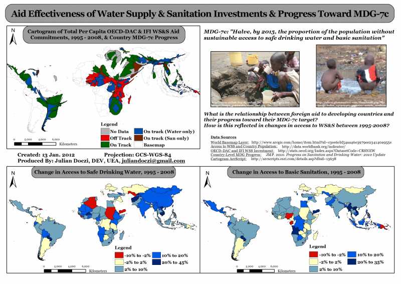
EDIT: Hmm. Looks like you aren't able to download this image to view it in a higher resolution. It looks pretty grainy if you're viewing it through this forum. Therefore, I have also uploaded it on my account at Scribd.com, you can view it in higher res by going to this link (be sure to download the image for high resolution viewing, don't just view it on Scribd): Link
Also, if you want a file copy of the high res image, please send me a message and I can email you one.
Best Regards,
Julian Doczi
Current Student, M.Sc. Climate Change and International Development
University of East Anglia, Norwich, UK
P.S. If I'm posting this in the incorrect forum, feel free to move it.
As you may know from my previous post on here ( Link ), I'm pretty interested in visual/spatial representations of sanitation issues, due to their powerful explanatory / emotionally provoking nature.
One interesting way of doing this for sanitation financing issues that I'm experimenting with is the use of cartograms - the style of map where country size is stretched or compressed based on an attribute of your interest. You can see some of these already created for basic sanitation/water supply access here: Link .
However, I haven't found one yet illustrating sanitation investments / foreign aid to sanitation, so I created one as a simple project for a GIS course I recently completed as part of my M.Sc. studies here in the U.K.
I created a simple cartogram map in ArcGIS for the developing world of the total WS&S foreign aid investment per capita to each country with available data for the 1995 - 2008 period (Note: 'foreign aid' here means official ODA commitments and development bank funding toward water supply and sanitation projects, but not NGO or private funding). This basically gives a "Dollars per person" measure that allows cross-country comparison.
The results were very visually interesting, with India and Bangladesh drastically shrunken compared to drastically inflated countries like Lesotho or Nicaragua.
On this cartogram, I also coloured each country based on whether or not they were judged as "on track" or "off track" on meeting their MDG for water and sanitation. This therefore gives some indication of the aid effectiveness of WS&S aid for this period, where inflated countries that are nonetheless off track on their MDG could be considered as more ineffective aid than countries where that investment correlates with their being 'on track' to the MDG.
Of course, this simple analysis does not account for a variety of other factors that can influence water and sanitation access, including the aforementioned private/NGO investment, as well as the country's own WS&S investment (this could be an idea for another cartogram!) or its general economic growth, so for a true indication, a (much more) complex panel data regression would have to be undertaken. As well, spatial representation like this can omit some of the most urgent countries - those that lacked any useable data and thus could not be represented on the map. Follow-up investigation would be needed to determine these countries' individual needs and issues.
However, in terms of effective messaging, I still think this simple map can serve as a powerful tool to illustrate to people various aspects of sanitation and that we as a sanitation community should make more of them.
I have attached a medium resolution JPEG image of the map project I created. I also have a low-res and high-res version if you're interested in obtaining it. You can feel free to disseminate it or use it in your work - just cite me as the author and contact me at the listed email address - I would be happy to work with you on a project that utilises maps like these! This map project also includes 2 other basic maps outlining the change in water supply and sanitation access from 1995 - 2005, as another piece of information to help assess each countries' sanitation situation. I created this with the idea that it could be used as a part of a conference poster or something similar, so I made it visually appealing.
I am curious to hear any feedback you may have on this work. Do you like it? Is it interesting? Has someone else already done a map like this before? What more could be added to it? What other types of cartograms and maps could we create?
This project only took me about 3 days of work (collecting and cleaning the data was the longest part), so it can easily be reproduced for your own particular circumstances (you could, for example, make one just focusing on the provinces or regions of your particular country if you have the data available), and, of course, you could vastly increase the sophistication of your output using the more advanced features of ArcGIS.
Please let me know what you think!
EDIT: Hmm. Looks like you aren't able to download this image to view it in a higher resolution. It looks pretty grainy if you're viewing it through this forum. Therefore, I have also uploaded it on my account at Scribd.com, you can view it in higher res by going to this link (be sure to download the image for high resolution viewing, don't just view it on Scribd): Link
Also, if you want a file copy of the high res image, please send me a message and I can email you one.
Best Regards,
Julian Doczi
Current Student, M.Sc. Climate Change and International Development
University of East Anglia, Norwich, UK
P.S. If I'm posting this in the incorrect forum, feel free to move it.
---
Julian Doczi
Senior Research Officer - Water Policy
Overseas Development Institute
UK
Julian Doczi
Senior Research Officer - Water Policy
Overseas Development Institute
UK
Attachments:
-
WSS_Invest...dRes.jpg
(Filesize: 71KB)
The following user(s) like this post: Elisabeth
Please Log in to join the conversation.
You need to login to reply
Share this thread:
- Markets, finance and governance
- Financing (taxes, tariffs, transfers) and cost estimates
- Mapping sanitation finance with cartograms
Time to create page: 0.200 seconds